Timeline
Mar 2024 - Jun 2024
My Role
UX Researcher, UI/UX Designer
Key Skills
Visual Design, Branding
Tools Used
Figma, Miro, Illustrator
Overview
In today’s digital age, it is difficult for users to keep track of the numerous paid subscriptions they have to different products and services. Every month, they may see charges on their bank accounts for services they may no longer want or even need.
Subtract is a company that offers a product to remedy this issue. However, the product is a desktop-only website that is not mobile-friendly. Thus, they are unable to reach a broader audience of potential users, of whom more than half use mobile devices.
The Problem
The company was looking to create a mobile-friendly version of their product in order to significantly increase their market reach, ultimately resulting in more users and more business.
Subtract’s newly designed mobile app allows users to track and manage subscriptions, view extensive spending reports and set alerts for upcoming payments.
The Solution
I was tasked with conducting user research, designing the UX and creating the branding/visuals for the new mobile app.
My Role
In order to support the company’s business goals, I needed to create the following user stories:
As a current user, I want to see all of my subscriptions in one place so that I can get a comprehensive view of my spending on subscriptions.
As a returning user, I want to unsubscribe from a subscription so that I can reduce needless spending.
As a consumer, I want to be notified if any of my subscriptions are about to be auto-renewed so that I can make a decision about if I want to renew the subscription and continue spending money.
Business Goals
Over the age of 30
Uses phone and desktop equally
Middle-class
Trying to be more budget-conscious
Target Users
Design Thinking Framework
Empathize
My secondary research consisted of a competitive analysis of existing subscription tracking products as well as research on the target market.
Secondary Research
In order to better understand the features users would expect from a subscription tracking product, I performed a competitive analysis on three industry leaders: Trackmysubs, OneMain Trim & Rocket Money.
Competitive Analysis
While the product is currently used in the US, the company will be expanding to the German market in order to significantly increase its user base. Therefore, I deemed it necessary to research the spending habits of German consumers. I then used these findings to help guide my design choices for the product.
Target Market
My primary research consisted of quantitative research, through screener surveys and qualitative research, through user interviews.
Primary Research
In order to conduct quantitative research, I put out a brief screener survey where I asked participants to tell me about their experiences managing their subscriptions. I received responses from 9 participants, as outlined below:
Quantitative Research
After reviewing the results of the screener survey, I selected 5 participants who I felt would provide more valuable information based on their responses. These user interviews were conducted over Zoom, where I asked the participants to talk more in-depth about their experience managing their subscriptions in order to better understand their goals and needs as users. Below are some of the key quotes given by users:
Qualitative Research
Define
In order to synthesize the findings of my research, I created a user empathy map. This allowed me to get inside the users’ heads and understand their thoughts and feelings when they go through the experience of managing their subscriptions.
User Empathy Map
I also created an aggregated persona of the users I interviewed to create a better sense of for whom I would be designing this product.
Persona
Lastly, I created a user journey map which helped me to further empathize with users during each step of their experience with the product. It also gave me the chance to identify any relevant design opportunities that could be implemented.
User Journey Map
View the full Miro board here
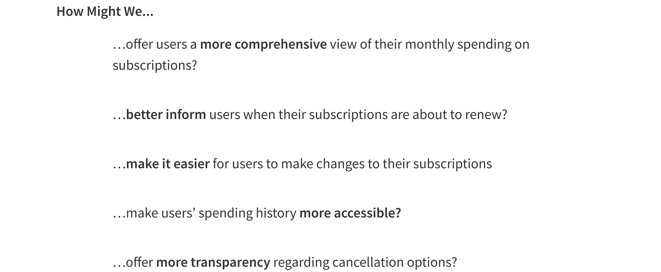
Having gained a better understanding of my users and their problems, I needed to begin thinking about how I could provide a solution for them. I took the top five insights from my research and reworked them into How Might We Statements.
How Might We Statements
Ideate
I created user flows to serve as visual representation of the product’s red routes, which I identified as View Subscriptions, Cancel a Subscription and Set Payment Alert, among others.
User Flows
View the full Miro board here
Before creating my lo-fi designs digitally, I made sketches with pen and paper to quickly get my ideas out.
Sketches
Once I completed all my sketches, I converted them into digital lo-fi wireframes. These would be used in the first round of user testing, which will be discussed further down.
Lo-Fi Wireframes
The brand personality of Subtract is described as a trusted friend who is helping you save money. Other key brand attributes are being trustworthy, caring, friendly and casual. I took these traits into consideration when designing the product’s branding. The primary color is a deep blue to reflect trustworthiness while the secondary indigo conveys a sense of wisdom to assure users that the product will help them to spend their money wisely.
Branding & Style Guide
Prototype
High Fidelity Mockups
After establishing a style guide, I applied it to my designs in order to have high fidelity mockups that I could use for my second round of user testing, as I will discuss below.
Test
Usability Testing - Round 1
For my first round of user testing, I did guerrilla testing using my lo-fi wireframes. I approached five strangers in the park and asked them to test out my prototype, giving them tasks to complete. The feedback I received was positive for the most part, though there were a few things that could have used adjustments. Below are the changes I made going from lo-fi to hi-fi designs, based on the feedback I received.
My second round of user testing was done after I made my hi-fi mockups. These were remote moderated tests conducted over Zoom with five participants. I once again gave users tasks to complete and asked for feedback. Once again, while there were no major issues, the feedback I received was helpful in adding some final polishes to the product.
Usability Testing - Round 2
The Finished Product
Reflections
With more experience under my belt for this project, I felt much more confident in my abilities as a UX Designer. Despite this, there were still many challenges along the way and plenty of learning opportunities. Overall, it was a rewarding project to work on and helped contribute to my growth as a designer.
Remember that your designs must meet the business’ goals. When working on a UX project, it is important to be aware of the stakeholders, including the organization for whom you are designing. Companies have specific goals that they seek to attain with their products and we as designers must make sure that the products we build will allow them to reach those goals
Establish a solid design system for your product. Utilizing components in your designs will help to ease your workflow. It will also save you a lot of time. For this project, I sourced many of the components from Material Design and used them as the basis for my designs. Other Figma features such as auto-layout are a huge lifesaver, as well!
Create a project plan and stick to it. Map out each section of the project and estimate how long they will take. This is helpful for making sure you stay on track and are effectively budgeting your time. I know this is something of which I especially needed to take note because I tend to fixate on small details and lose sight of the bigger picture.
Key Takeaways
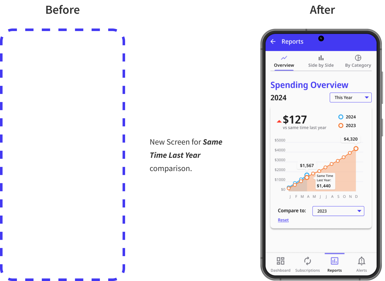
A big chunk of this project involved creating various graphs to breakdown users’ spending on their subscriptions. I would love to push this concept further with more detailed graphs and more in-depth analyses.


