Timeline
Jul 2024 - Aug 2024
My Role
UX Researcher, UI/UX Designer
Key Skills
Content Auditing, User Testing
Tools Used
Figma, Miro, Google Docs
Overview
Agora Tutoring is an online marketplace that specializes in connecting students with local tutors for in-person educational sessions. By focusing exclusively on face-to-face interactions, it aims to foster a more personalized and effective learning experience. The platform ultimately serves as a bridge between students seeking tailored educational support and independent tutors looking for meaningful teaching opportunities.
Company Background
The primary objective of this project was to comprehensively review and enhance the Agora Tutoring website's user experience, from initial user registration to overall site usability. The aim was to improve the website's voice, navigation, and content to create a more intuitive, engaging, and user-friendly platform for students and tutors.
Project Goals
I was part of a UX Design team with three other exceptional designers. At each phase of the project, we worked separately before coming together and deciding on the best ideas amongst the four of us.
My Role
We worked closely with our client, the founder of Agora Tutoring, to ensure the scope of the project was manageable for our one-month timeline. He was very flexible and receptive to our feedback. In the end, we were able to redesign the user flows for three major functions of the site: Signup/Onboarding, the Landing Page and Post Creation for both students and tutors.
The Results
Design Thinking Framework
Empathize
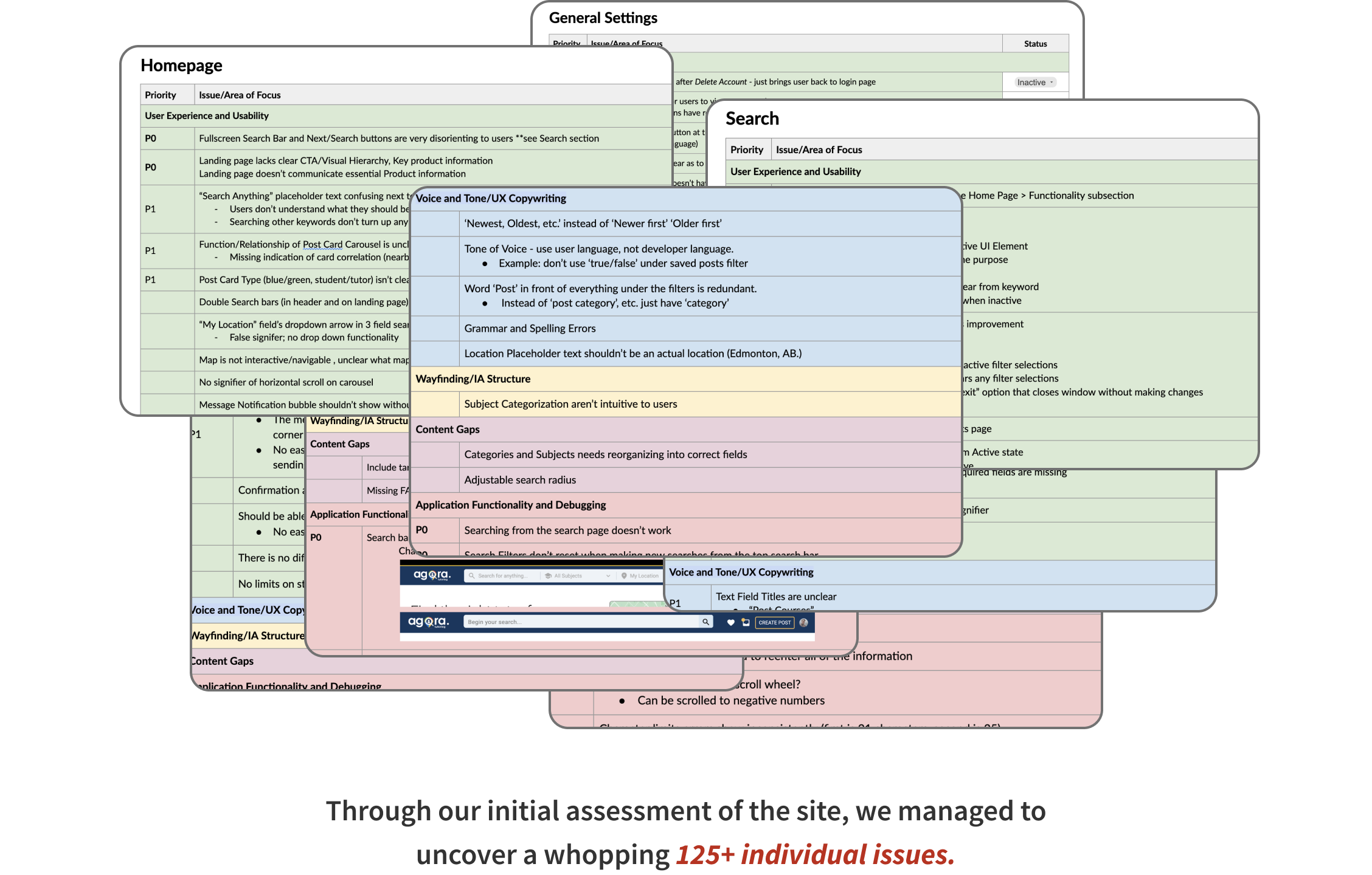
Our first course of action was to review the website in its current state. This allowed us to put ourselves into the shoes of our users and identify potential usability issues.
We combed through the entire site, searching for even the most minute issues. We then sorted these issues under the following five categories:
Content Audit
Another way in which we assessed the site’s usability was to conduct user testing of the site in its current state. We recruited 8 users, who were unfamiliar with product, and had them go through the red routes of the site.
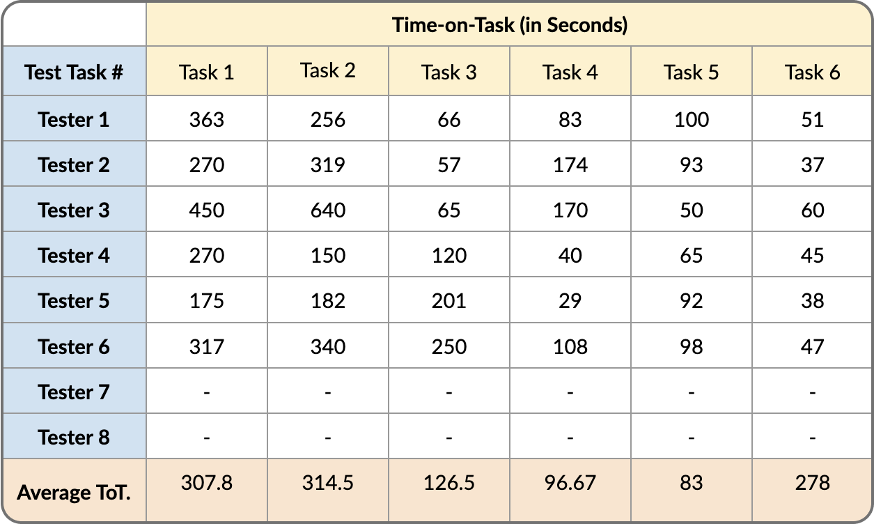
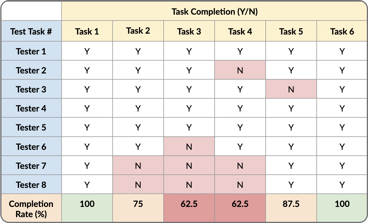
In order to have quantitative data to which we could refer later on, we used the following metrics as our KPIs:
Initial Usability Test
The results of these tests were as follows:
Define
After analyzing the results of both the content audit and user testing, we were able to identify the areas of the site with the most usability issues. This helped us to narrow the project scope and determine the user flows that could be improved.
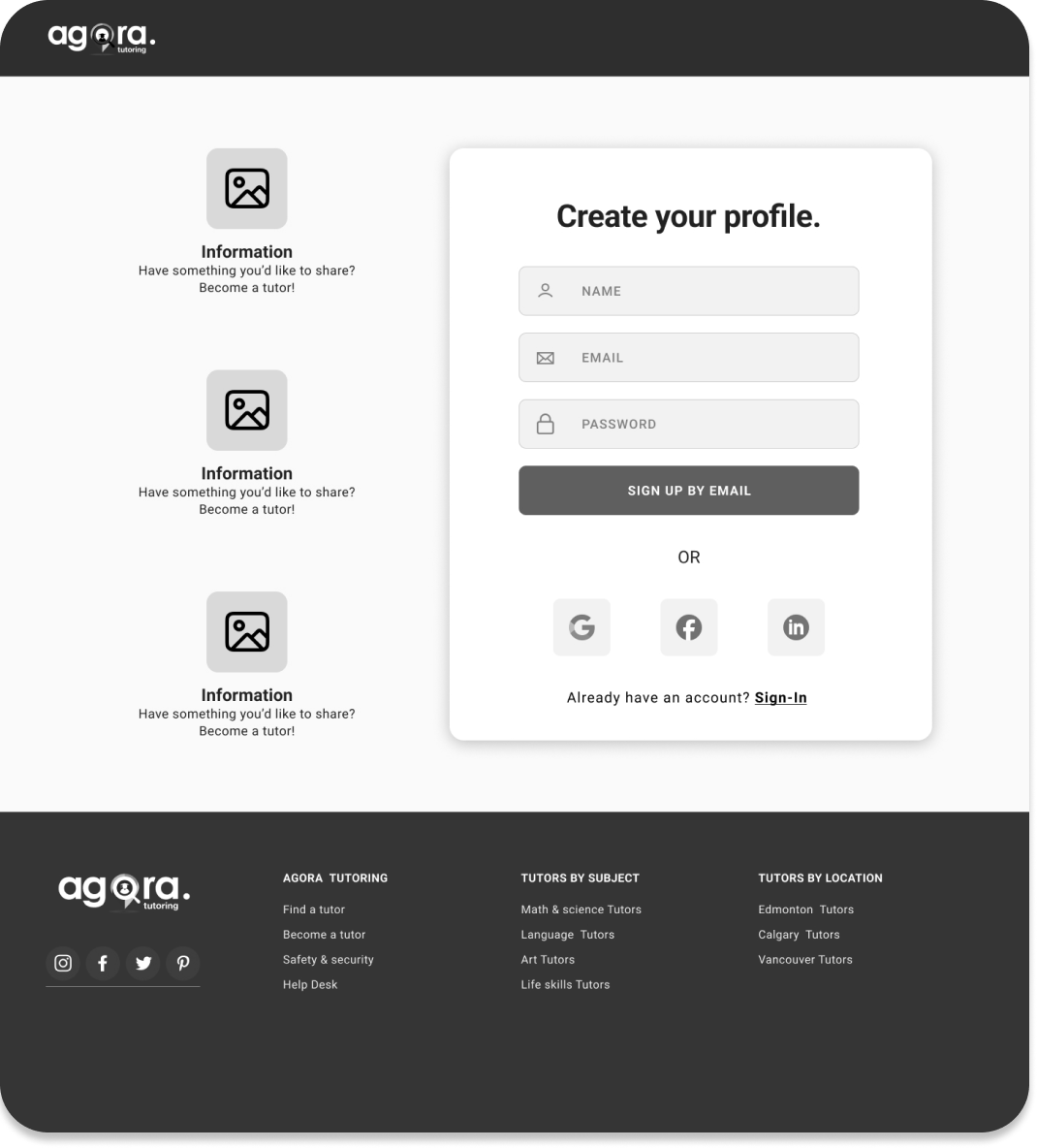
As early as creating an account, users were already running into problems. Issues identified in the Signup/Onboarding flow included unnecessary friction, unclear input fields and lack of error prevention measures. Encountering such errors early on will encourage user abandonment.
Signup/Onboarding
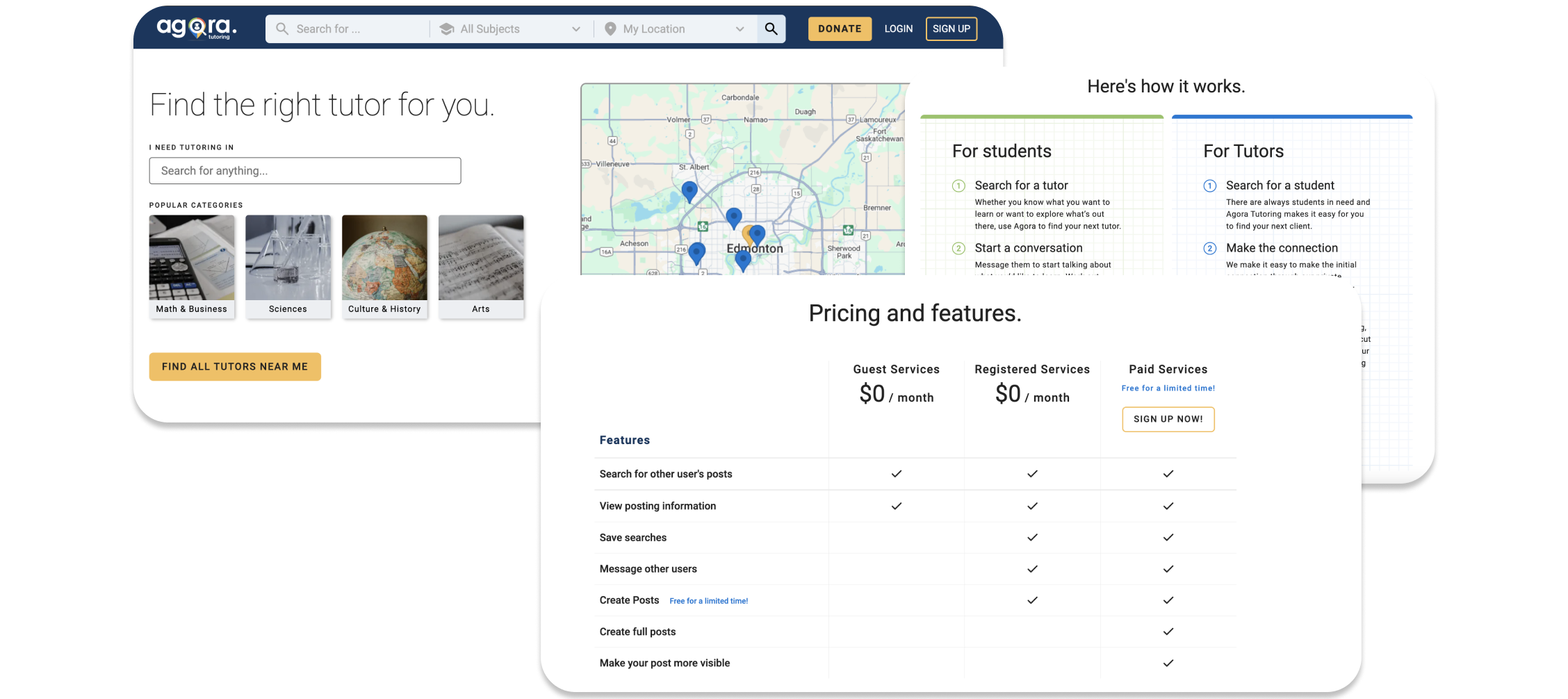
Overall the site’s landing page failed to communicate a clear value proposition. Many key elements lacked context and were not presented in a visually appealing manner. The information hierarchy also had room for improvement, with important product information being buried further down on the page.
Landing Page
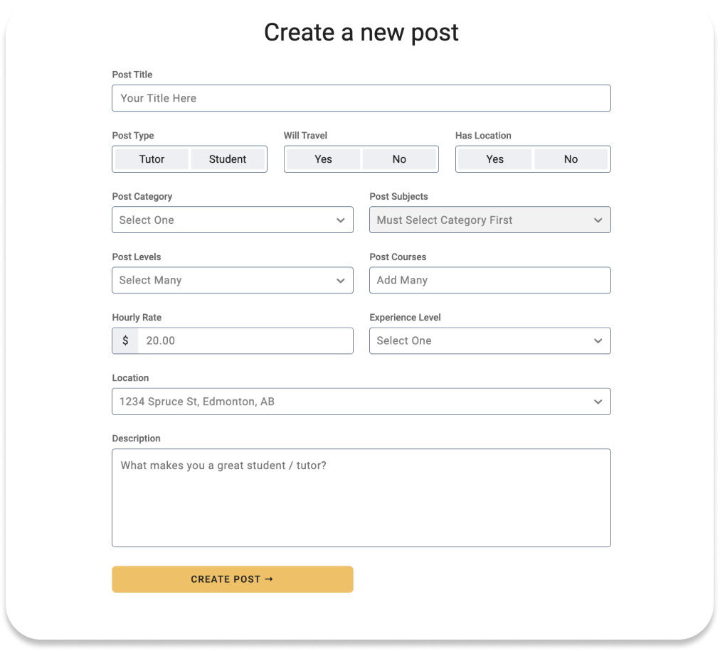
The biggest issue with post creation was that the user flow was identical for both students and tutors. This was an issue because these are two distinct user groups each with their own unique set of needs. Having them use the same form to make their posts creates unnecessary friction and confusion for users. Additionally, users felt that there was information that they would have liked to have known or shared, that they weren’t prompted to include.
Post Creation
Ideate
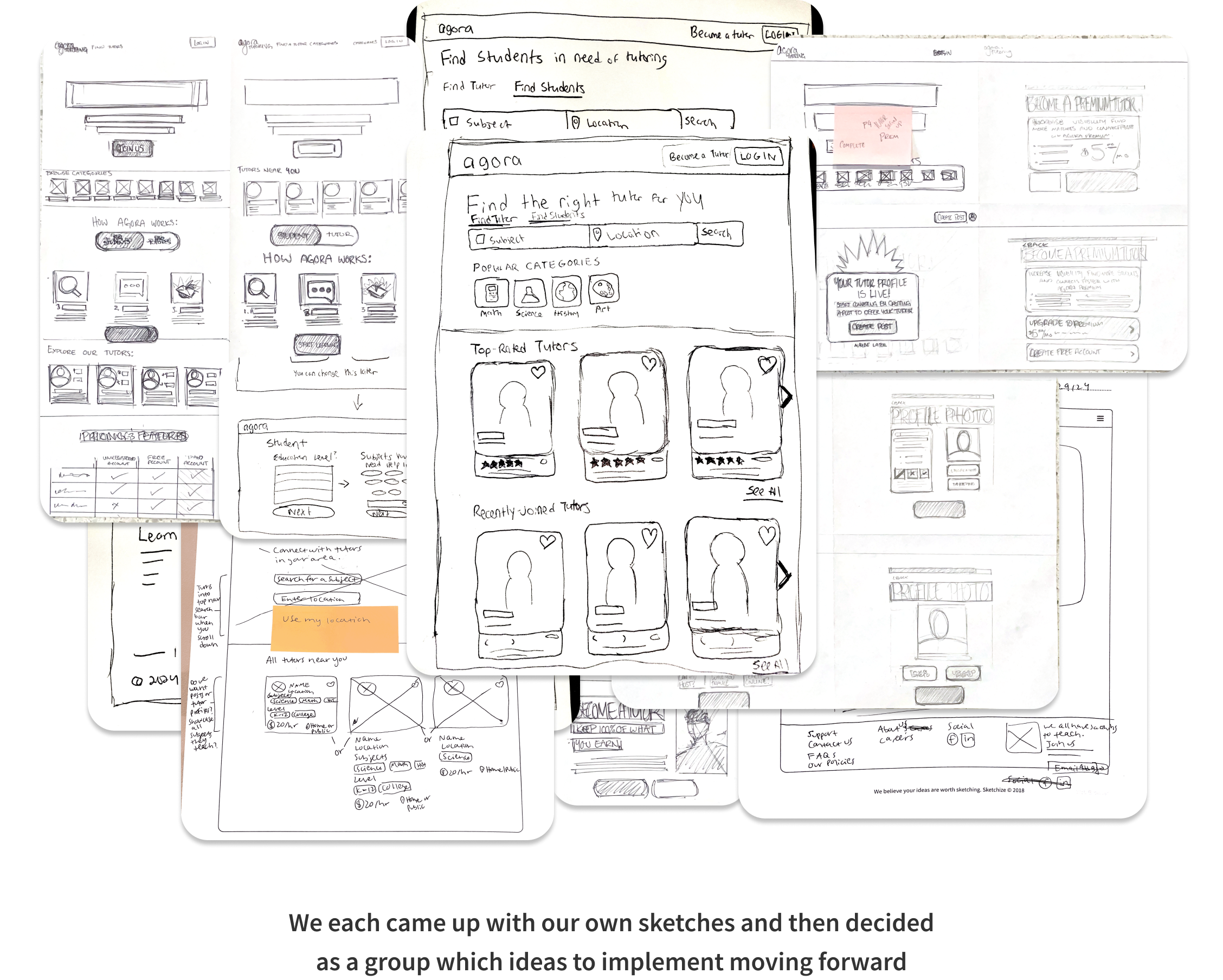
Having established the scope of the project, our team began ideating solutions by creating rough sketches of each of the user flows.
Sketches
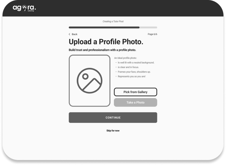
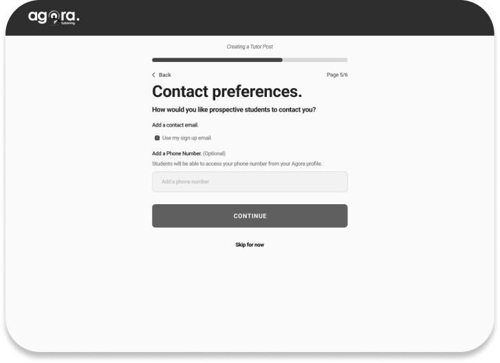
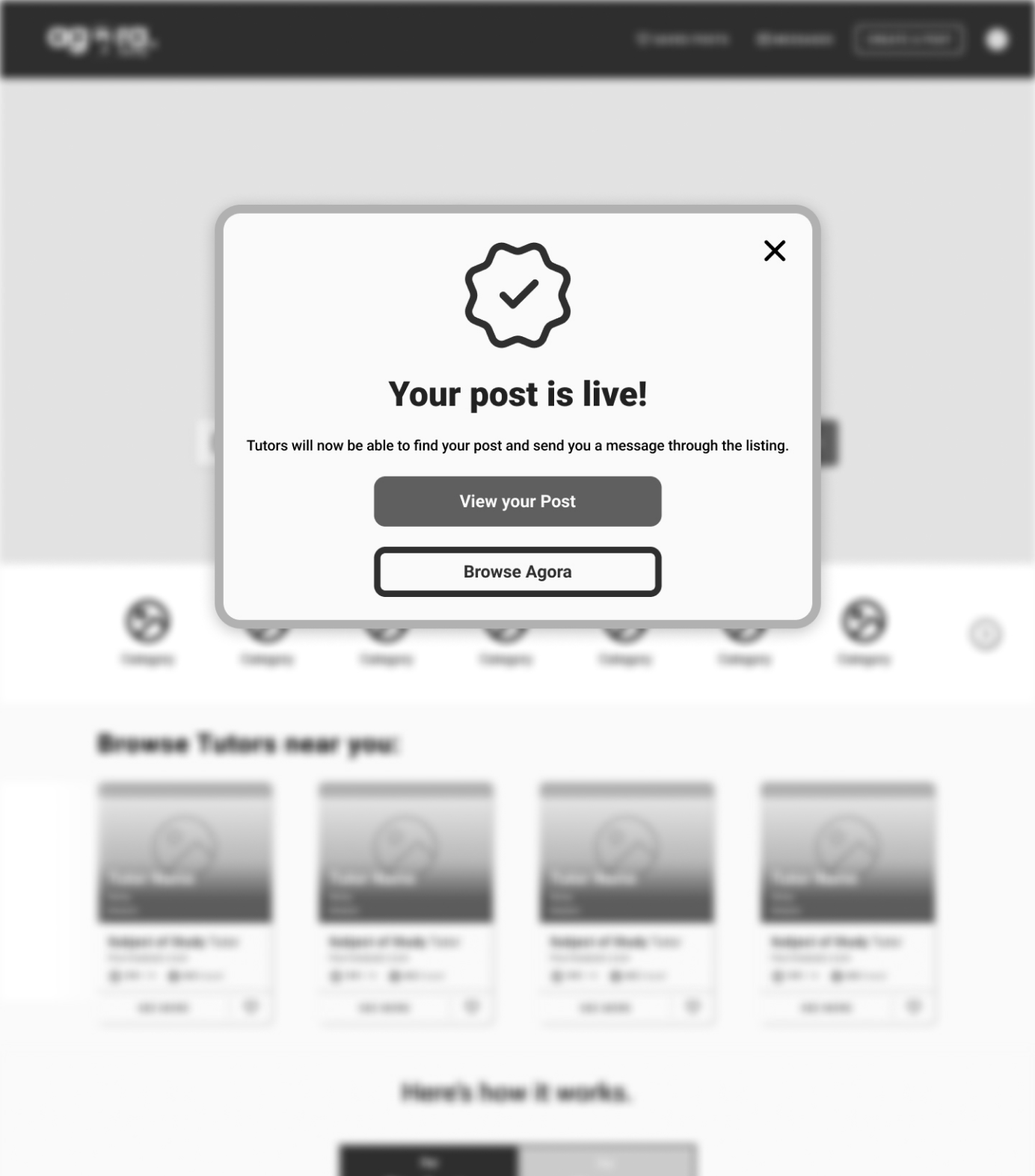
Once the team agreed upon a design direction, we began creating low fidelity wireframes from our sketches. This was helpful because it allowed us to present our designs to the client without committing to any particular visual design choices at this stage.
Wireframes
Signup/Onboarding
Landing Page
Post Creation
Prototype
Our client was pleased with the direction of our designs. The next step was to take those wireframes and apply the company’s existing style guide to create high fidelity mockups that could be used for a second round of user testing.
Hi-Fi Mockups
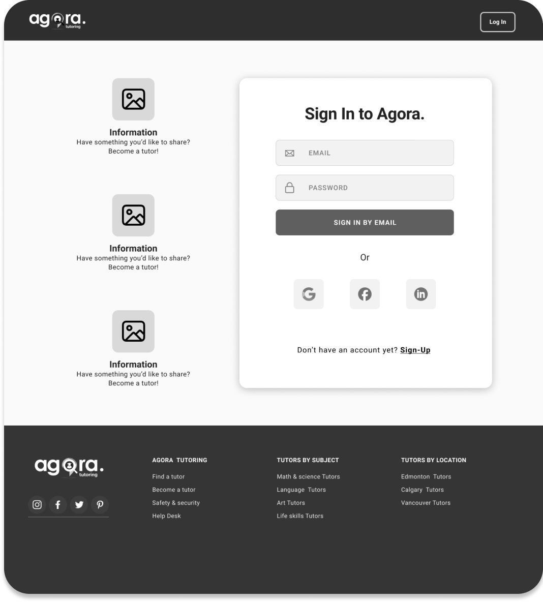
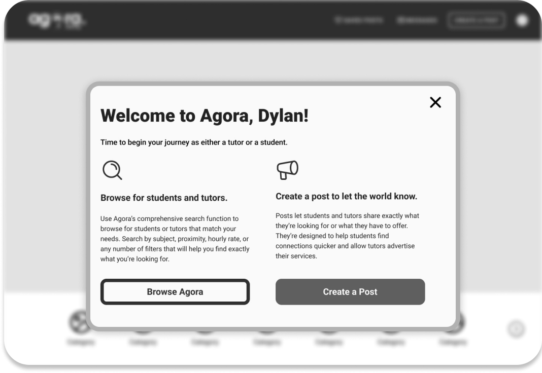
Our goal was to make the signup and onboarding processes as frictionless as possible. We did so by employing an industry-standard design for the signup/sign in screens, which included SSO options. We also streamlined the flow by requiring the user to enter only the most essential info upon the initial signup.
Signup/Onboarding
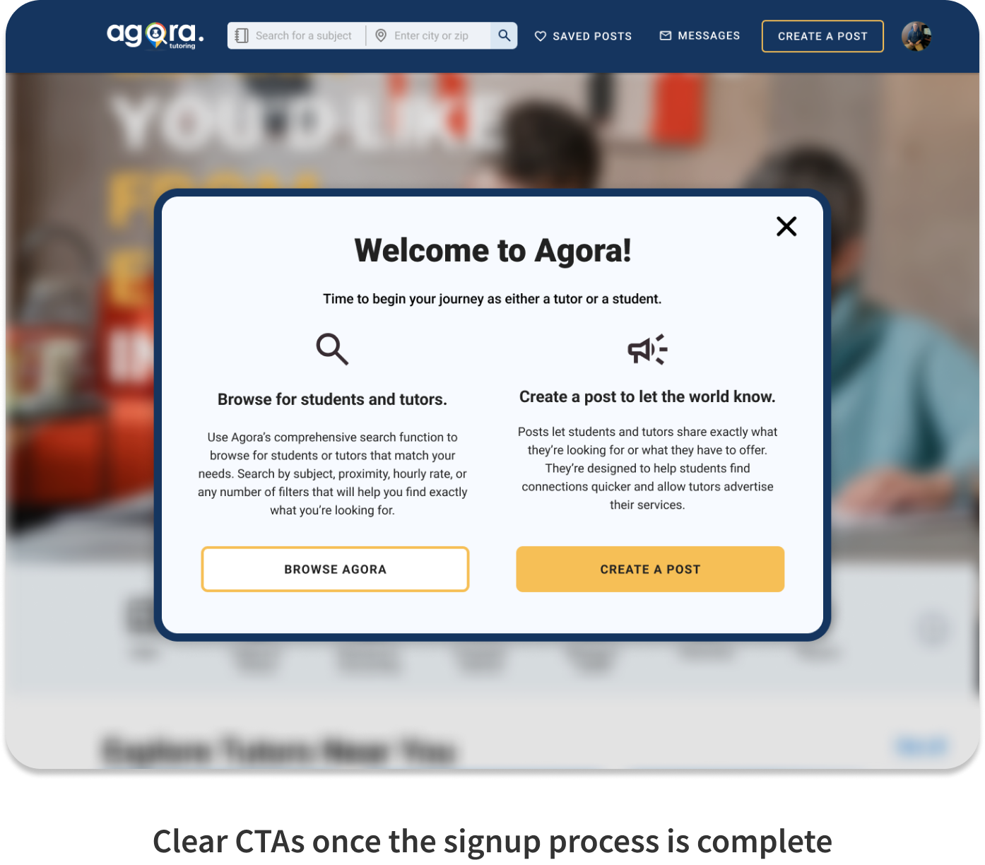
The landing page was completely revamped so that users would have a clear understanding of Agora’s value proposition as soon as they entered the site. There is no longer any ambiguity about the product or how it works. Everything that the user needs to know is presented to them in a clear, visually appealing manner.
Landing Page
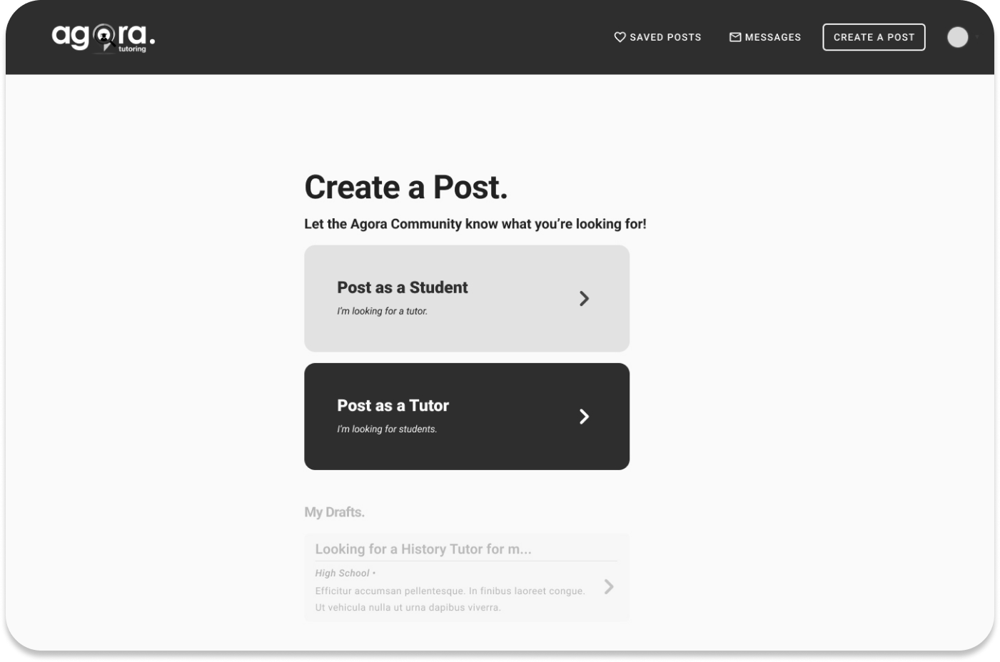
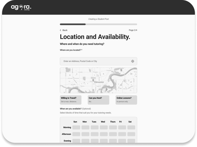
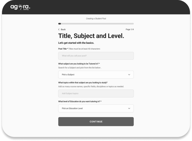
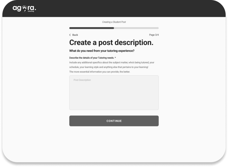
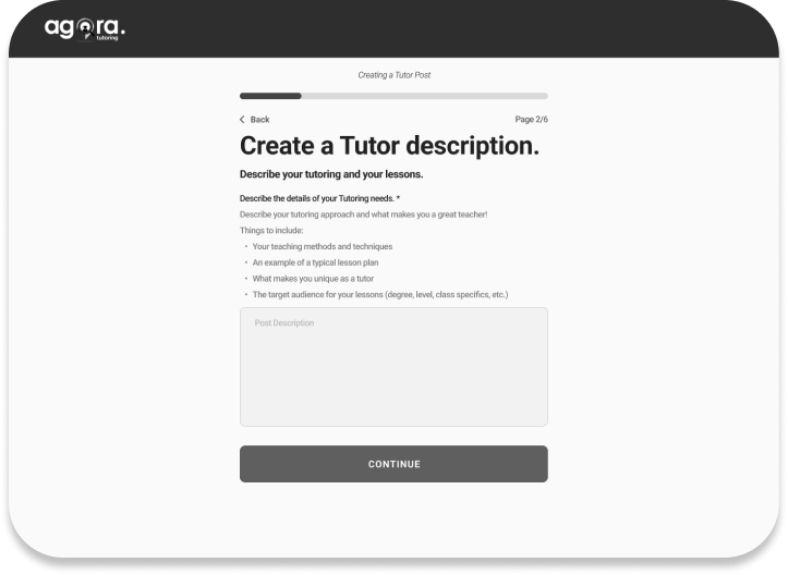
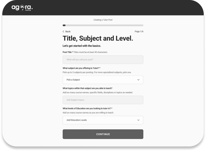
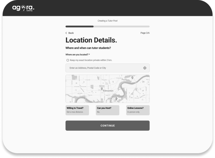
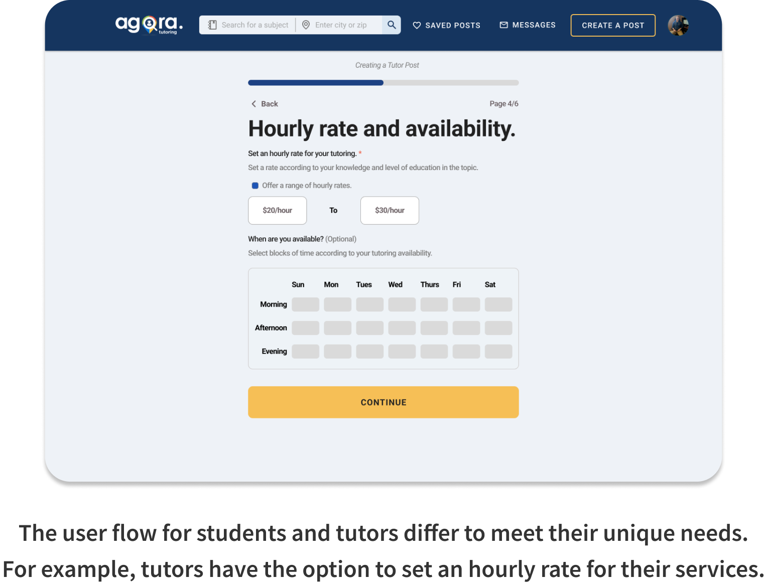
We redesigned the post creation flow so that students and tutors now have a similar but different experience, allowing the unique needs of each users group to met. The process for students is more streamlined, allowing them to quickly put out a call for their tutoring needs. Tutors, on the other hand, are more incentivized to market themselves on the site, and are thus willing to endure a bit more friction to advertise their services.
Post Creation
Test
In order to validate our final designs, we conducted a second round of user testing, using the same KPIs as before:
Validation
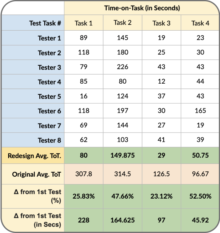
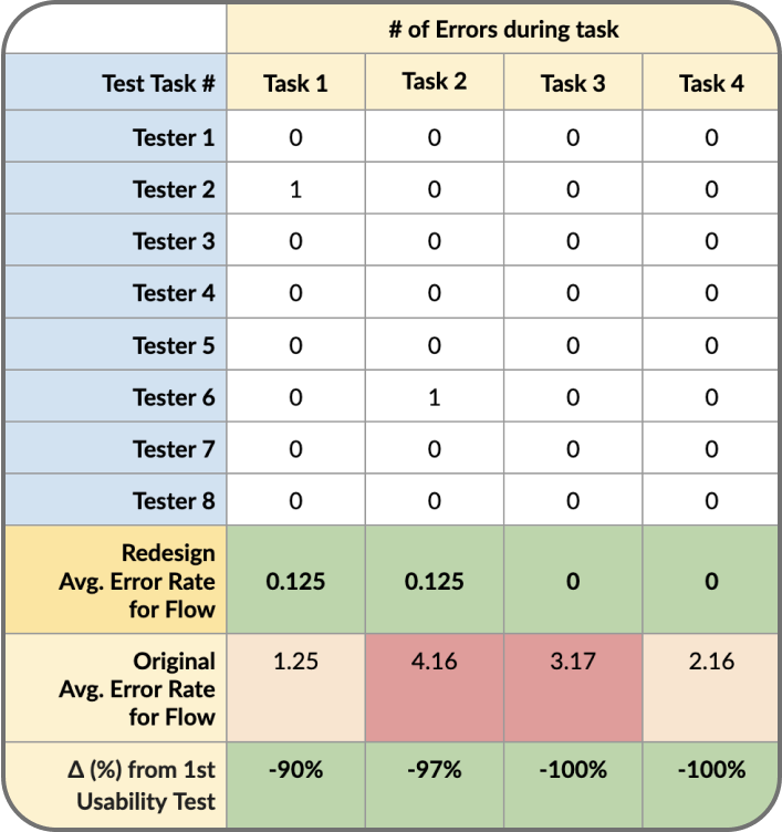
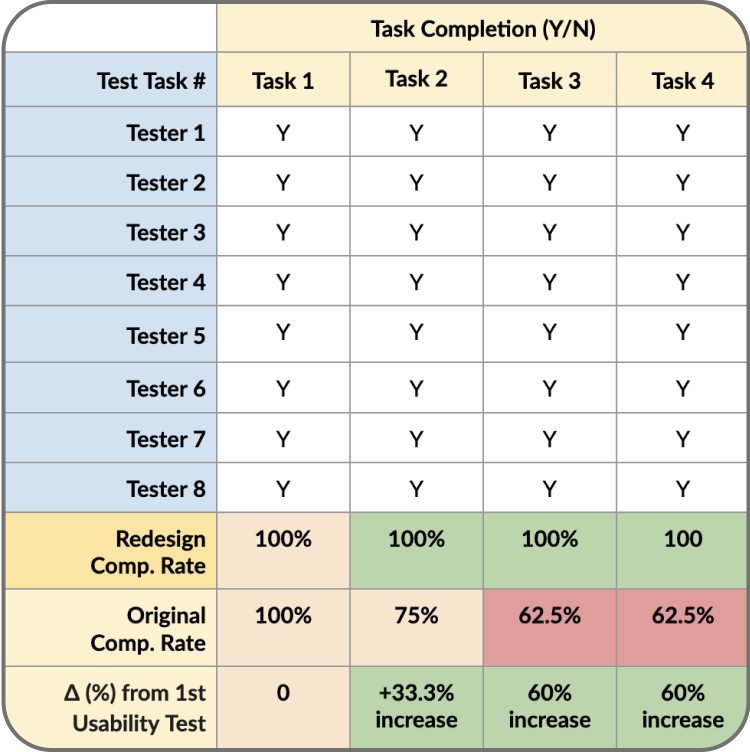
The results this time around showed major improvements:
Key Figures
The Finished Product
Reflections
This project was an enjoyable and rewarding experience. It was great to be able to work with a team of other talented designers and bounce ideas off of one another. It was also great that we had a client who was flexible and receptive to our ideas, which made the whole process go much smoother. It was truly rewarding to see the fruits of our labor at the end, knowing that our designs will help to improve the experience for future users as well as help the company to grow.
Teamwork makes the dream work. As cliche as it sounds, it really was true for this project. Despite having never worked together prior to this, our team was able to come together and produce great work in just a few short weeks.
Keep stakeholders in the loop. Design is a collaborative process so it’s important that all relevant stakeholders are involved. I would say that for this project, my team was successful in our communication with our client. With regular weekly check-ins and email updates, there was never any uncertainty on either end as to what was happening.
Make sure the project scope fits the timeline. I felt our team was able to clearly define a project scope that was doable in the one month timeline we were given for the project. This was in part, once again, due to working with the client on what needed to be done, rather than simply for them.
Key Takeaways
Although Agora Tutoring is still in the process of getting ready to launch, we were told by our client that that work we did “[had] already become building blocks for future projects.” Having helped to lay a strong foundation for it, I’m confident that the company will see great success in the future.


