Timeline
Jun 2023 - Dec 2023
My Role
UX Researcher, UI/UX Designer
Key Skills
Visual Design, Branding
Tools Used
Figma, Miro, Illustrator, Mockup
Overview
Inspired by the recent controversy surrounding Ticketmaster’s disastrous handling of Taylor Swift’s Eras Tour, I chose to explore issues in the ticketing industry. From unreasonably long wait times in virtual queues to dealing with scalpers and hidden fees, there is certainly no shortage of issues plaguing concertgoers. I sought to better understand these frustrations and subsequently design a product that allowed for a more seamless ticket purchasing experience.
The Problem
Ticket Troupe is a mobile application that allows for easier coordination when purchasing concert tickets for groups. Users can create a group, or troupe, with friends and family to plan concert outings, share tickets and handle payments, all in one place.
The Solution
As the sole UX Designer for this multi-month, end-to-end project, I handled everything from UX research to UI design to usability testing.
My Role
Design Thinking Framework
For this project, I used the iterative process that is the design thinking framework. I often found myself reiterating on my designs as I was presented with new information.
Empathize
As any good UX designer should, it was important for me to empathize with my users. When conducting user research, I used empathy to understand exactly who the users were. This allowed me to identify their needs so that I could design a product that would satisfy those needs.
I conducted secondary research on the ticketing industry to better understand who is attending concerts and what challenges they are facing when purchasing tickets. Below are some of my key findings:
Secondary Research
Having established a good base of insights through my secondary research, I then moved on to conducting primary research. This took the form of quantitative research, through screener surveys and qualitative research, through user interviews.
Primary Research
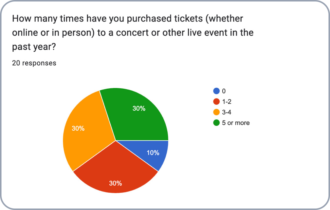
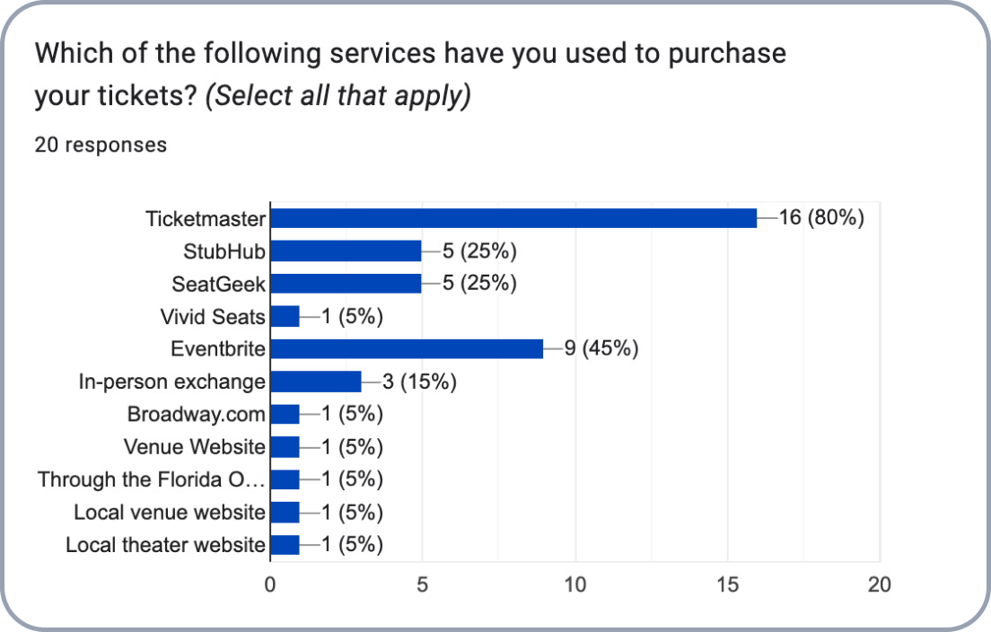
In order to conduct quantitative research, I put out a brief screener survey where I asked participants to tell me about their experiences purchasing tickets to concerts and other live events. I received responses from 20 participants, as outlined below:
Quantitative Research
After reviewing the results of the screener survey, I selected 5 participants who I felt would provide more valuable information based on their responses. These user interviews were conducted over Zoom, where I asked the participants to talk more in-depth about their experience purchasing concert tickets in order to better understand their goals and needs as users. Below are some of the key quotes given by users:
Qualitative Research
Another way in which I empathized with users was to understand the products they currently use to purchase tickets. I did so by conducting a heuristic analysis of three competitors in the industry, in which I gave each a rating out of 5 for three heuristics I believed to be most important when designing my own product.
Heuristic Analysis
Define
After my user research was concluded, it was then time to begin synthesizing my findings in order to define a problem. This synthesis was done through a number of methods.
I created an affinity map to categorize my findings into recurring themes. This helped turn my jumble of information into cohesive data.
Affinity Map
View the full Miro board here
I then took the same findings from my affinity map and converted it into a user empathy map. This allowed me to get inside the users’ heads and understand their thoughts and feelings when they go through the experience of purchasing tickets.
User Empathy Map
View the full Miro board here
Lastly, I created an aggregated persona of the users I interviewed to create a better sense of for whom I would be designing this product. In this case, I felt it was only necessary to create a single persona as I didn’t anticipate my product having multiple user groups.
Persona
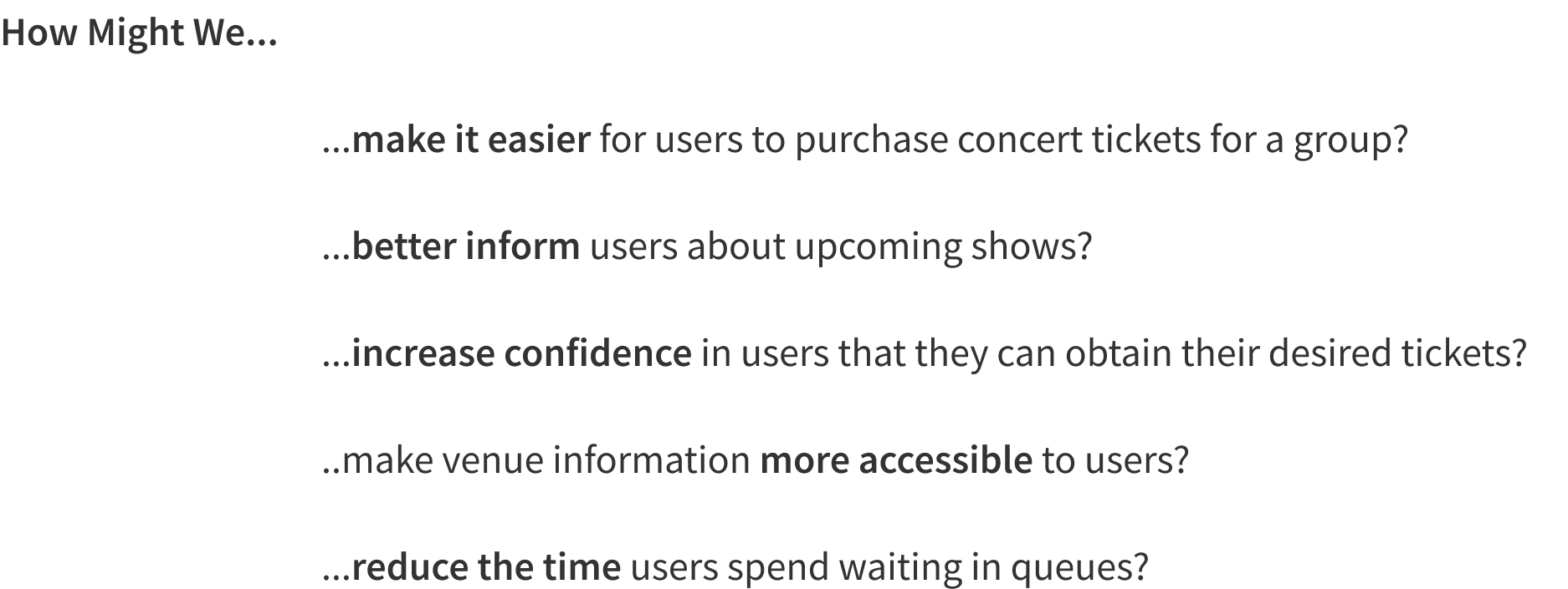
Having gained a better understanding of my users and their problems, I needed to begin thinking about how I could provide a solution for them. I took the top five insights from my research and reworked them into How Might We Statements.
How Might We Statements
Ideate
With the research out of the way, it was now time for the fun part: designing a solution to the problem. This, of course, was another multi-step process with plenty of iterations along the way.
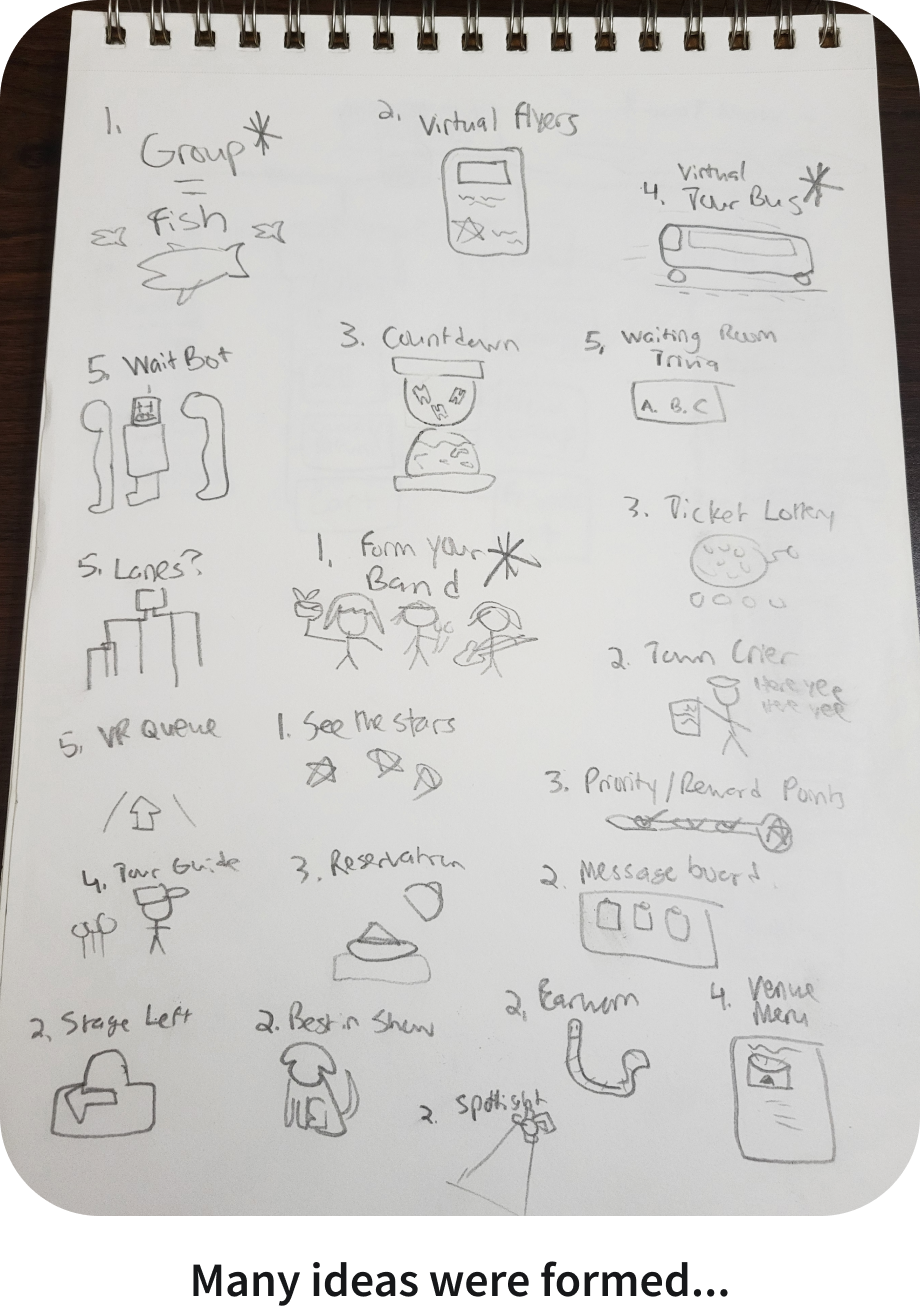
I conducted a brainstorming session to rapidly generate solutions to the five HMW statements I created earlier. I spent one hour sketching out as many ideas as I could think of onto paper.
Brainstorming Solutions
Focusing on how make group purchases an easier experience, the initial idea for the app imagined the user as a member of a band embarking on a world tour and recruiting other members (friends) to take part in gigs (events). It was a vague solution that aimed to add an interactive element to the purchasing experience and perhaps make it more enjoyable. As the project progressed, the concept ended up in a slightly different direction but the spirit of this original idea remained.
With my not quite realized concept in mind, I thought about how I could make a Minimum Viable Product (MVP) out of this idea. At its core, this was still a ticket purchasing app, so it was imperative to include a way to purchase tickets. Also, as the selling point, it needed to incorporate some sort of interactive group element. Anything else would be designated to Priority Level 2 or lower.
User Story
View the full Miro board here
With a better idea of the product’s features, I now had to think about how all of this content would be organized. To have a clear visual, I created a site map, which helped me establish the product’s information architecture.
Site Map
View the full Miro board here
I created user flows to serve as visual representation of the product’s red routes, which I identified as Discover a Show/Purchase a Ticket, Create a New User Group and View/Share Tickets with Group.
User Flows
View the full Miro board here
I initially used the traditional pen and paper to create my sketches. However, at the recommendation of my mentor, I ended up using a sketching tool called Mockup to streamline to process.
Sketches
With my rough sketches in hand, I created a prototype for users to test. I approached strangers in the park and was able to find five participants who were kind enough to help me out.
Guerilla Usability Testing
I translated my rough sketches into low fidelity wireframes based on the feedback I received from my guerrilla usability testing.
Wireframing
An overview of all the wireframes I created.
To select a name for my product, I used an AI generator. One of the names it suggested was Ticket Troupe. I felt this name was perfect for several reasons: it was catchy, alliterative and the word troupe refers to a group of musical performers, tying it back to both concerts and the group element of the app. With this new name, I felt that my previously uncertain solution was more fully realized.
Using my graphic design skills, I created a logo for the company to serve as one of the key branding elements. The logo consists of a type lockup paired with an abstract icon resembling both a ticket and a person. The three circles also represent a troupe gathering together around the ticket.
Branding & Style Guide
The personality of the brand is all about enjoyment and the experiences that make people feel good. It is reliable but doesn’t take itself too seriously. I created a style guide that would reflect this identity and also help to maintain visual consistency throughout the product. For example, the primary brand color is a trustworthy navy blue with bold accents of magenta and gold to complement it.
Prototype
The culmination of my design efforts in the ideate phase lead me to creating a prototype of the final product that I would use in testing to receive feedback from users.
High Fidelity Mockups
I applied my established style guide to my wireframes to create high fidelity mockups of my product’s multiple screens. These mockups would then be used in my prototype.
Test
The next step was to conduct usability testing. The goal of these tests was to uncover any usability issues in my product’s red routes.
For my first round of usability testing, I recruited five participants for remote moderated testing sessions over Zoom. I had participants look at the prototype I prepared and encouraged them to think out loud as much as possible about what they were seeing and doing. I asked them to complete the following three tasks:
Find a concert you’d like to attend and purchase tickets for said concert.
Let your friends know you’ve purchased concert tickets for them.
Find a way to communicate future purchases between you and three friends.
Usability Testing - Round 1
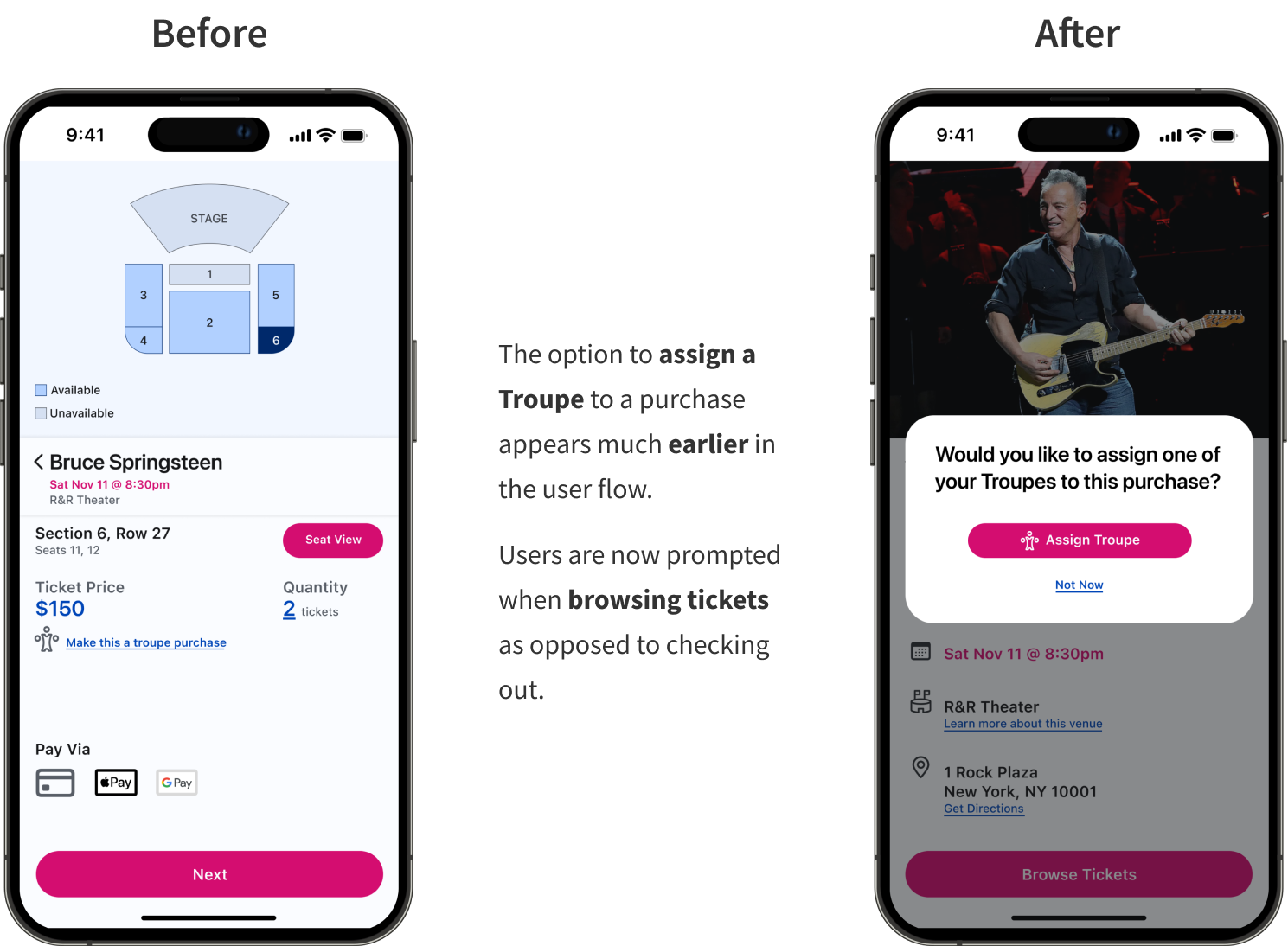
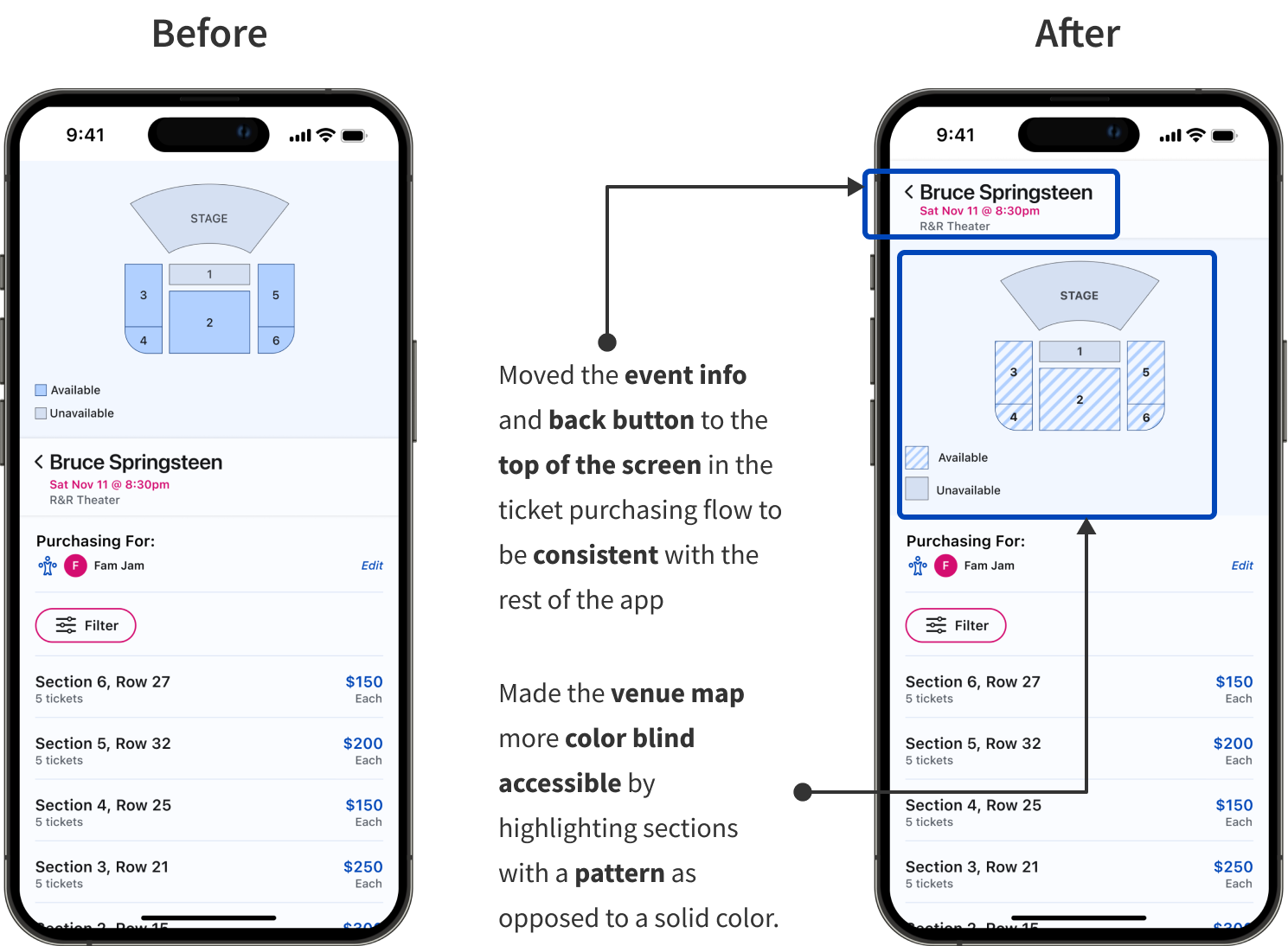
Based on the feedback I received from my users, I made changes to my prototype with the aim of conducting a second round of testing. Below is a highlight of some of the major changes that were made:
Iterations
For the second round of testing, I recruited five new participants to test my reiterated designs. Once again, these were remote moderated tests conducted over Zoom.
During the first round of testing, I noticed that the wording of my tasks was a little confusing for some users so I tried rewording them to be more comprehensive:
Find a concert you’d be interested in attending and then purchase tickets for that concert.
Assign a troupe to an unassigned ticket and then share this update with the troupe.
Find a way for you and three friends to communicate plans for future events.
Usability Testing - Round 2
I felt that I did a good job addressing any major usability issues during the first round of testing. This was reflected in the results of the second round, where the feedback I received only concerned minor UI tweaks.
Iterations
The Finished Product
Reflections
This project was definitely a learning experience. The biggest challenges came from figuring out how to implement the design thinking process at every step. Not to mention, this was the first end-to-end UX project that I ever completed. Although I had some guidance from my mentor along the way, I undertook it all on my own. After many late nights and long hours, I am proud of the final result.
It can be challenging to develop new products in a space where one company has a stronghold. As I learned from my research, Ticketmaster essentially has a monopoly on the ticketing industry. This made it challenging to develop a product that would really stand out and offer something new. Nevertheless, I believe Ticket Troupe offers a unique solution that will satisfy the needs of concertgoers looking to purchase tickets for large groups.
Make sure to have a solid concept for your solution. When I initially came up with a solution, I didn’t think too much about the logistics of the app features. This became evident later on during usability testing when users addressed concerns about things they felt were missing. Thankfully, I used this feedback to make changes and solidify the concept.
Don’t get too caught up in the small details. As a self-described perfectionist, I tend to get caught up in the little things when working on a project. Things were no different for this one. I probably spent more time than I should have making things pixel perfect when I should have spent more time thinking about the big picture.
Key Takeaways
Moving forward with this product, I would like to try to implement some features that didn’t make it into the MVP, such as customizable avatars and an AI assistant.


